How De Gruyter’s New Open Source Font Came to Be
A new font will be used in De Gruyter’s journals and books from now on — one that can be used and shared free of charge, thanks to an open source license. We recently talked to the project managers Franziska Bühring and Florian Ruppenstein about the reasons for the change, which is part of De Gruyter's open research strategy, and about the development process.
“The feedback from our colleagues has been clear: they say one can hardly see that the font has been changed. And this was actually one of our goals.”
That’s what Franziska Bühring, Senior Manager Product Data, Metadata and Standards, says when asked about the new font that will be used in De Gruyter’s books and journals from now on. At first glance, her answer is surprising. It might make you wonder why the effort was made at all.
In fact, the reasons for introducing a new font were not visual but practical. “Our goal was to find a new font that would give us more flexibility and openness in our work with manuscripts,” says Franziska, who managed the project together with her colleague Florian Ruppenstein, Production Editor at De Gruyter.
The development of the new font, which was to replace the previous Meta Science in De Gruyter publications, began about a year ago. It was clear from the outset that the team was looking for a license-free font and did not necessarily want to reinvent the wheel. With support from the Leipzig-based publishing services provider le-tex, Franziska and Florian analyzed a number of candidates as possible variants.
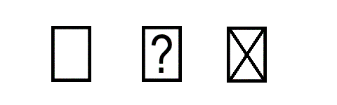
That’s how they ended up with Noto Semicondensed, a freely available typeface family of Google’s Noto. According to its developers, “Noto” means “I write/note” in Latin and also “no more tofu”. In practice, the latter phrase has nothing whatsoever to do with the soy product. Instead, it refers to the struggle to avoid the “notdef” character — an empty rectangle that appears when a typeface lacks a certain character such as an umlaut or an accent mark. Sometimes the rectangle, which is disparaged as a tofu cube, contains an X or a question mark. The goal of the Noto project, which was initiated in 2011, was to serve as many typeface systems as possible and thus avoid using the notdef character.
“Noto’s Semicondensed variant is typographically very close to the fonts we used before,” says Florian Ruppenstein to explain another aspect of the decision. The next step was to adapt the original font specifically to the publisher’s needs. “At De Gruyter, we deal with an incredible multitude of different publications and disciplines,” says Franziska Bühring. “And within these individual disciplines there are many specific cases, such as formulas, transcriptions, and other typeface systems, some with the text running from right to left. All of these requirements had to be transferred to the new font.”
Among other things, the team checked to see which characters were used in the previous fonts, in order to ensure that the material previously created with them can also be displayed in the new font without any problems. The suggestions for improvement, comments, and wishes that had been collected over the years were also incorporated into the development process.
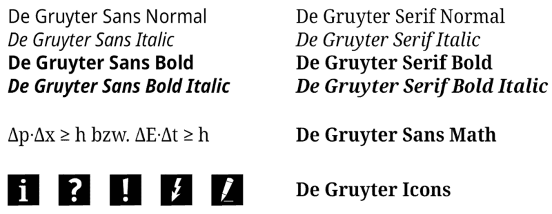
The result was De Gruyter Sans and De Gruyter Serif. Both of them, like the original font, are freely available on the web thanks to an open font license. This includes not only free use and distribution but also the possibility of further adaptation and improvement by the community, which ultimately benefits all users and, of course, the publisher as well. According to Franziska and Florian, the entire process took place in the spirit of De Gruyter’s open research strategy.
In practical terms, the open license also makes it easier to work with authors — especially in what is known as the CRC workflow. In publishing, CRC stands for “camera-ready copy” and means that the manuscripts are already submitted more or less “ready for printing” in terms of layout and typography. For this purpose, contributors are provided with LaTeX and/or Word templates — and now also with the new De Gruyter font.
In order to avoid having to make all the adjustments all over again in the event of future extensions of the original Noto font, le-tex has developed a script environment that can generate the De Gruyter variant with all of its special features from Noto at any time. The font and the script can now be downloaded from the open source developer platform Gitlab.
When asked if there were any unexpected moments during the development process, Florian Ruppenstein replies, “Although I knew it in theory, in practice I was surprised by how many components of an extensive font are related to one another. Small parts — diacritical marks such as accents, tremas, and tildes — occur in umpteen other different characters, which means that if you change something in one place, you have to make the same change in many other places as well.”
***
Learn more about Open Research at De Gruyter!

[Title image: De Gruyter]