How We Run Sprints to Optimize Digital Tools for Academic Research
A cross-departmental team at De Gruyter recently ran a design sprint to optimize some of our existing academic databases. Here’s what we learned.
Besides publishing academic books and journals in all disciplines, De Gruyter hosts more than 70 different databases on its website degruyter.com. Now “database” might not sound like the sexiest thing on earth, but many of these inconspicuously-looking tools are actually used quite heavily, simply because they are, well, useful to a lot of researchers.
Among the most well-known databases on degruyter.com are AKL (Allgemeines Künstlerlexikon), which has over 1.25 million entries, EBR (Encyclopedia of the Bible and Its Reception Online) and TLL (Thesaurus Linguae Latinae), a specialist Latin dictionary that, admittedly, even many folks working at De Gruyter hadn’t heard of until it was recently featured in a portrait in the New York Times (“Wait a minute – that’s OUR database?!”).
Why sprint?
We’re proud of our databases — and we’re also aware of some of their shortcomings. We’d hear time and again from users on social media, during user experience research sessions or in private conversations, for instance, that while the content may be very useful, the user experience and interface can sometimes leave much to be desired.
That’s one reason why we decided to devote a whole week to optimize just that. We were also in the midst of redesigning our website and had to think about what all of our existing databases should look like in the new design, anyway.
Our idea of a sprint was loosely based on the GV design sprint process, which we adapted to our own purposes. We wanted to tackle this project in a 5 day-sprint in order to foster cooperation between departments and be able to build a prototype and test it with actual users in a short period of time. (Spoiler: it worked really well!).
Academic databases: Same same but different
Now what is an academic database? That’s exactly what we asked ourselves as a first step towards optimizing them. Our need to classify and group all of these quite similar but also quite different products in some meaningful way is what led to the creation of what is now internally known as “The Wall.” The Wall shows all the different types of databases that we offer pinned to one of the walls of our open floor office in Berlin (rather than in a spreadsheet on a screen).
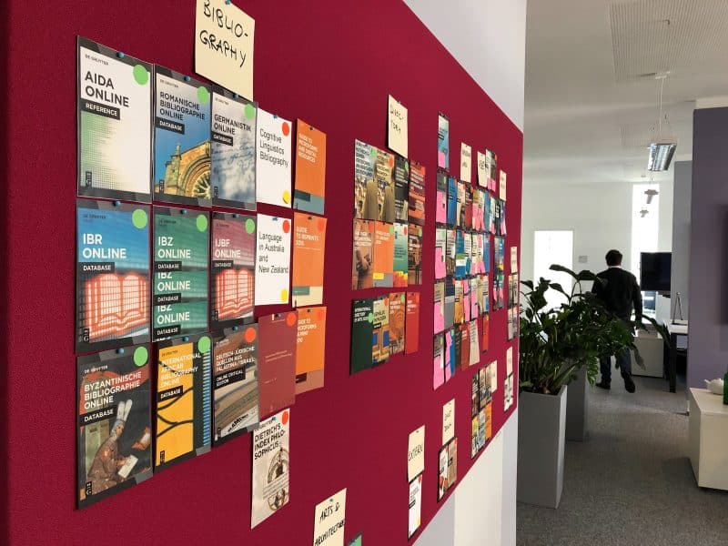
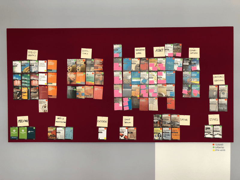
A lot of our conversations during the next couple of days took place in front of this wall.
Day 1: Scope and database product types brainstorm
So what did we do on Monday morning after drinking too much coffee and arming ourselves with lots of post it notes and sharpies?
The initial scope of the sprint was to migrate our database products to a new platform. We spent much of day one discussing the similarities and differences between the products and product types.
We found that what all of our databases have in common is this: they’re digital tools to help academics master their research. The different types allow researchers to perform a quite diverse set of tasks. With bibliographies, for instance, academics can quickly find the available research literature on a given field, subfield or topic to create a list of the literature.
A reference work, on the other hand, gives academics access to a collection of concepts and their descriptions in a particular field of study to get an overview of that field. Critical editions give users access to the original or most authoritative version of a text along with close reading and detailed analysis.
Ultimately we decided to narrow the sprint’s focus down to one product type: bibliographies.
Day 2: Strategy for database products and user stories for bibliographies
The first half of the second day was about discussing general business objectives for our databases. In the afternoon we went on to create user stories for bibliographies. So we first asked ourselves what we, as a publisher, expect from our databases. After that we talked about what our users want to achieve with them.
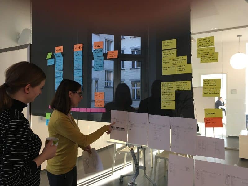
The user stories we came up with were based on our experience with the products as well as user research done prior to the sprints (among others, we’d used a survey on our website).
- As a researcher, I want to be able to create customized lists relevant to my research topic so that I can save them
- As a researcher, I want to be able to create customized lists relevant to my research topic so that I can download them
- As a researcher, I want to auto-upload my customized lists to an asset manager so that I can later easily use and manage them
These user stories were assumptions that we wanted to validate during the next couple of days.
We also identified some of the specific challenges that we’re facing with our databases:
- Users need to seek out database products themselves to gain access as they do not appear in library discovery system search results (or search engines like Google)
- Students use Google or Google Scholar and this has a huge impact on how they expect to search for and discover content today
- Students often only use resources recommended by their professors or lecturers
- Librarians have no time to explain individual databases to students and researchers
With all of this background info in hand, we felt prepared to do the actual designing and prototyping the next day.
Day 3: Design and refine
On day three we first created some of the most important user flows for our products. These user flows (aka UX flows, or flowcharts), help designers understand and anticipate how users expect to use a product, in order to create products that enable this state of flow.
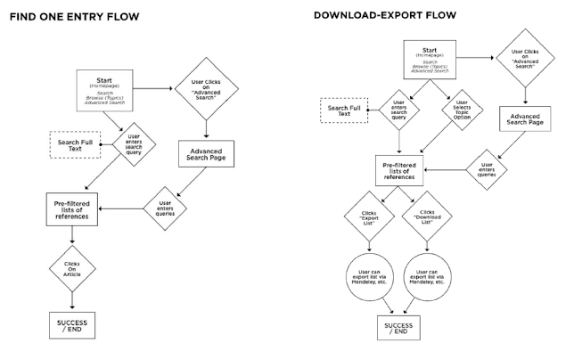
Based on these and the user stories created on the second day, we designed initial interactive wireframes in Axure.
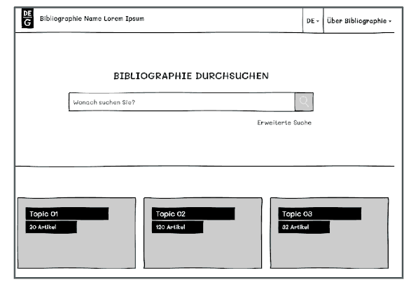
We created a much more prominent search field because we learned from previous customer feedback that we needed to put more focus on search compared to our existing interface. We also wanted to introduce the large amount of content that we have in a more accessible and structured way.
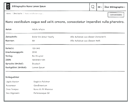
Being halfway through the week we felt slightly tired at the end of day 3. But the excitement of the progress we were making and the fact that we were going to talk to real life users the next day kept us energized!
Day 4: User feedback and further modification
Now came the exciting part: Day 4 would be devoted to testing the wireframes we’d built with actual users. We had several humanities researchers come into our office and test our prototypes.
We started by asking the academics to tell us about their day-to-day tasks and the resources they regularly used. We then showed them the wireframe and explained that we wanted them to take part in a test where participants are asked to continuously think out loud — that is, simply verbalise their thoughts — as they move through the user interface or wireframe.
“The benefit of this approach was that we essentially let users take the lead.”
The benefit of this approach was that we essentially let users take the lead, we observed how they used the wireframe, what they found easy to use, but, more importantly, we also got to hear their misconceptions, i.e. when they made wrong assumptions about some parts of the user interface. Ultimately, the approach gave us a fair impression of what did and didn’t work in terms of functionality.
Luckily, the feedback to the interactive wireframe was mostly positive. Most assumptions that we’d come up with prior to the testing were also confirmed. But we were still surprised with some of the results. For instance, users were expressly uninterested in the actual result page for individual titles and the information and metadata that is displayed on that page. Instead, they either wanted to export the entry to a reference management software of their choice or access the content right away.
Users also wanted additional search filters, like the possibility to display only titles from the last 5 years or display only content that the user has full access to. This feedback was immensely helpful and it will allow us to further optimize the databases.
Day 5: Retrospective and presentation, define next steps
Looking back at the sprint week on the final day, we felt that the first sprint day could have been more structured, mainly due to the fact that our goal was not clearly defined beforehand. We also agreed that setting even two goals had probably been one too many. We decided that next time we’d definitely need more planning ahead, especially in order to line up more test users.
On the positive side, we felt we’d been very focused once we’d found our goals. We did not try to solve everything at once and we worked well in the cross functional sprint team. And we succeeded in creating a prototype and testing it with actual users.
What we’ve learned
The most important insight from the sprint was this: the user tests confirmed that one (modular) interface fits the needs of most of our bibliographies. The best starting point for users is a prominent search box to enter topics, keywords, titles, or names.
Most use cases for bibliographies see users wanting to get to customized lists relevant to a research topic and then to download these lists. But we learned that the question of access to content is equally important.
The process once again showed that sprinting not only works wonders in terms of breaking up departmental silos and cooperating, but also that it can lead to quicker and better results when done right. We have not only managed to gather first user feedback on our bibliographies but also phrased business objectives for our database products in general based on our publishing strategy. Our team also learned that they can do user testing too and the enormous benefits of hearing users’ stories first hand.
So the next step is obviously: More sprints!
Have a look at one of our databases here:
[Title Image by De Gruyter]
